Matlab is installed on most PCs at IPT. To plot for example a parabola, a first step would be to generate x and y data. We define x by typing this at the matlab prompt: x=0:0.1:1;
The right hand side has three numbers separated by two colons. The first number is the first data value. The second number is the step length. The third number is the end value. The semicolon at the end is to avoid displaying the components on the screen The same x-values could be generated with this construct: x=[0 0.1 0.2 0.3 0.4 0.5 0.6 0.7 0.8 0.9 1.0]; This approach specifies each single data point, separated by a space-character. The values should be enclosed in brackets Our intention was to create a parabola. We get this by taking the square of x: y=x.^2; Note the dot preceding the caret. It is necessary for exponentiation, multiplication and division. The values in the variable y are: 0 0.01 0.04 0.09 0.16 0.25 0.36 0.49 0.64 0.81 1.0 We can now plot a simple parabola from this variable: plot(y) The graph looks like this:
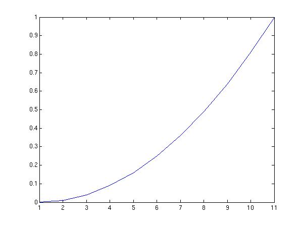 The shape of the parabola is recognizable,but the x-axis requires some
modification. Actually the values along the x-axis correspond to
the component number of y. It is better to include both x and y
in the plot command
plot(x,y)
Now the scaling along the x-axis has improved:
The shape of the parabola is recognizable,but the x-axis requires some
modification. Actually the values along the x-axis correspond to
the component number of y. It is better to include both x and y
in the plot command
plot(x,y)
Now the scaling along the x-axis has improved:
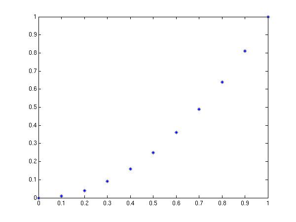
 Matlab draws straight lines between the data points if nothing else is specified.
This is altered by entering a third component for the plot command.
plot(x,y,'*')
Matlab draws straight lines between the data points if nothing else is specified.
This is altered by entering a third component for the plot command.
plot(x,y,'*')
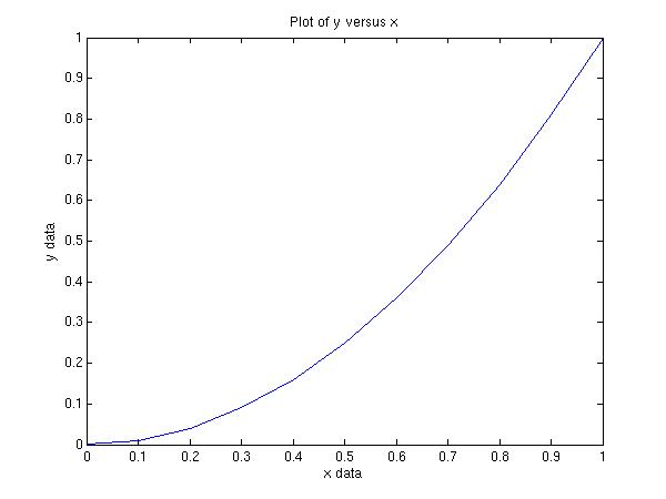
 Text along the axis can be included by these commands
xlabel('x data')
ylabel('y data')
title('Plot of y versus x')
This yields:
Text along the axis can be included by these commands
xlabel('x data')
ylabel('y data')
title('Plot of y versus x')
This yields:
 When a figure is acceptable it can be saved. To save as a jpg file, write:
print -djpeg -r75 filename
This yields the file filename.jpg. "-r75" indicates the size of the jpg-image.
Other formats are possible. Default is postscript format. Check "help print" for more
When a figure is acceptable it can be saved. To save as a jpg file, write:
print -djpeg -r75 filename
This yields the file filename.jpg. "-r75" indicates the size of the jpg-image.
Other formats are possible. Default is postscript format. Check "help print" for more
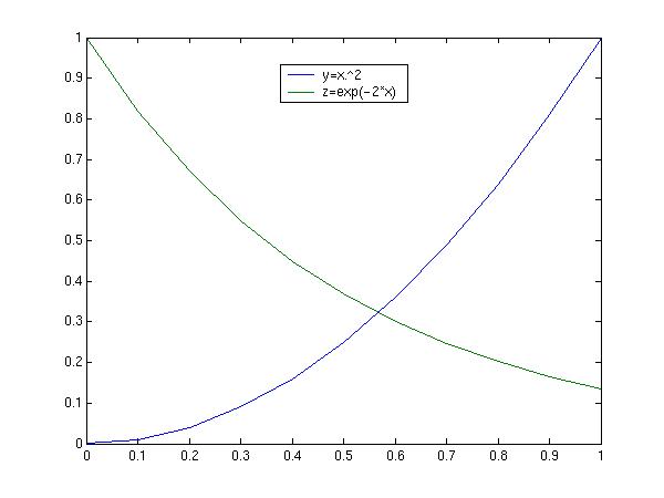
Another dataset may also be generated and included in the figure z=exp(-2*x); This is included in the plot this way: plot(x,y,x,z)
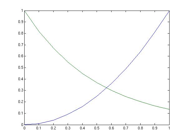 Inserting legends is often useful
legend('y=x.\^2','z=exp(-2*x)')
This yields
Inserting legends is often useful
legend('y=x.\^2','z=exp(-2*x)')
This yields
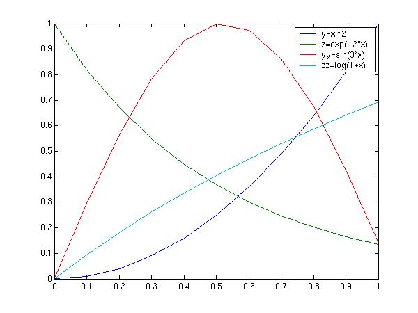
 More curves can be included like this:
yy=sin(x*3);
zz=log(1+x);
plot(x,y,x,z,x,yy,x,zz)
legend('y=x.\^2','z=exp(-2*x)','yy=sin(3*x)','zz=log(1+x)')
More curves can be included like this:
yy=sin(x*3);
zz=log(1+x);
plot(x,y,x,z,x,yy,x,zz)
legend('y=x.\^2','z=exp(-2*x)','yy=sin(3*x)','zz=log(1+x)')
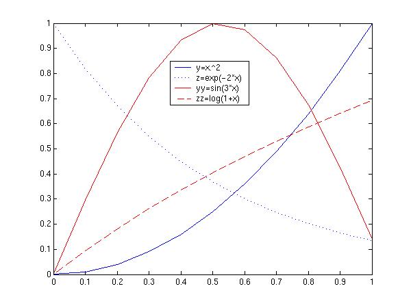
 It might be a good idea to make the lines more distinguishable. That
can be done by specifiyng the linestyle
plot(x,y,'b',x,z,'b:',x,yy,'r',x,zz,'r--')
legend('y=x.\^2','z=exp(-2*x)','yy=sin(3*x)','zz=log(1+x)')
It might be a good idea to make the lines more distinguishable. That
can be done by specifiyng the linestyle
plot(x,y,'b',x,z,'b:',x,yy,'r',x,zz,'r--')
legend('y=x.\^2','z=exp(-2*x)','yy=sin(3*x)','zz=log(1+x)')
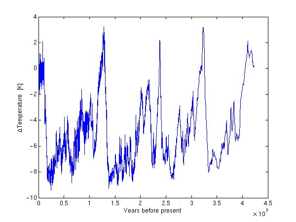
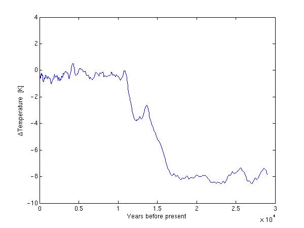
Suppose you have a dataset obtained from e.g field or laboratory work. Before we can plot or do any operations, we need to load the data from file into matlab. The simplest procedure is to use the load command. If the datafile is named "datafile.dat", we write: load datafile.dat Then we have created a matlab-variable named datafile A prerequisite for this to work is that "datafile.dat" contains no text, and the number of columns must be the same for each line. An example of such a dataset is the file vostemp.dat The file contains two coloums. The first is years before present. The second column is temperature. (The data is extracted from icecores obtained by drilling down three km in the Antarctic ice.) We load this into Matlab: load vostemp.dat Matlab now contains the array-variable "vostemp" The column indicating years before present can be addressed like this vostemp(:,1) The column indicating temperature is referred to by vostemp(:,2) The colon before the comma tells matlab that we will use all the lines from 1 to 1133 The number after the comma indicates the column number. Instead of using all the lines of column 2, we might have extracted just the first ten. This would be implemented as vostemp(1:10,2) When plotting the temperature as function of year before present, we want "vostemp(:,1)" to represent the x-coordinates and "vostemp(:,2)" to represent the y-coordinates. plot(vostemp(:,1),vostemp(:,2))
 We include x- and ylabel
xlabel('Years before present')
ylabel('\DeltaTemperature [K]')
We include x- and ylabel
xlabel('Years before present')
ylabel('\DeltaTemperature [K]')
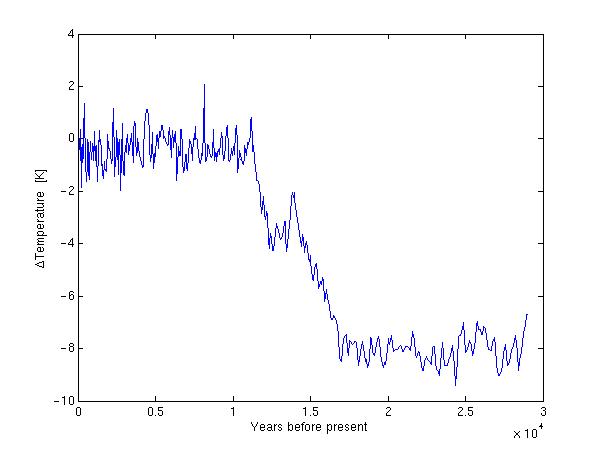
 We might want to focus a little more on the near present. One way of doing this is to plot
only the first 500 lines
plot(vostemp(1:500,1),vostemp(1:500,2))
xlabel('Years before present')
ylabel('\DeltaTemperature [K]')
We might want to focus a little more on the near present. One way of doing this is to plot
only the first 500 lines
plot(vostemp(1:500,1),vostemp(1:500,2))
xlabel('Years before present')
ylabel('\DeltaTemperature [K]')
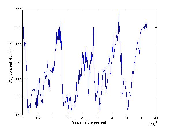
 A dataset of CO2 would be interesting to include for comparison with the temperature data.
We therefore download the file CO2.dat
It contains 362 CO2 measurements in column 2 and corresponding year before present in column 1.
load CO2.dat
plot(CO2(:,1),CO2(:,2))
xlabel('Years before present')
ylabel('CO_2 concentration [ppmv]')
A dataset of CO2 would be interesting to include for comparison with the temperature data.
We therefore download the file CO2.dat
It contains 362 CO2 measurements in column 2 and corresponding year before present in column 1.
load CO2.dat
plot(CO2(:,1),CO2(:,2))
xlabel('Years before present')
ylabel('CO_2 concentration [ppmv]')
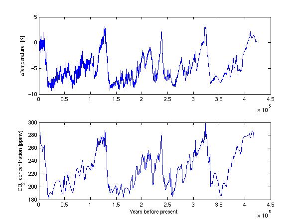
 The difference in scale and units for the CO2 and temperature might warrant
plotting in separate areas. This can be accomplished with the subplot command
subplot(2,1,1)
plot(vostemp(:,1),vostemp(:,2))
ylabel('\DeltaTemperature [K]')
subplot(2,1,2)
plot(CO2(:,1),CO2(:,2))
xlabel('Years before present')
ylabel('CO_2 concentration [ppmv]')
The difference in scale and units for the CO2 and temperature might warrant
plotting in separate areas. This can be accomplished with the subplot command
subplot(2,1,1)
plot(vostemp(:,1),vostemp(:,2))
ylabel('\DeltaTemperature [K]')
subplot(2,1,2)
plot(CO2(:,1),CO2(:,2))
xlabel('Years before present')
ylabel('CO_2 concentration [ppmv]')
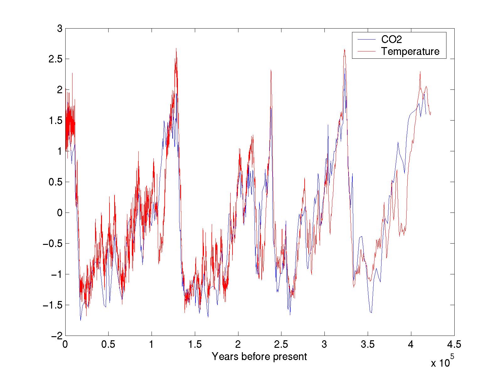
 If we remove the mean value and divide by the standard deviation for
respectively CO2 and temperature, we can obtain
a direct comparison.
plot(CO2(:,1),(CO2(:,2)-mean(CO2(:,2)))/std(CO2(:,2)))
hold on
plot(vostemp(:,1),(vostemp(:,2)-mean(vostemp(:,2)))/std(vostemp(:,2)),'r')
xlabel('Years before present')
legend('CO2','Temperature')
If we remove the mean value and divide by the standard deviation for
respectively CO2 and temperature, we can obtain
a direct comparison.
plot(CO2(:,1),(CO2(:,2)-mean(CO2(:,2)))/std(CO2(:,2)))
hold on
plot(vostemp(:,1),(vostemp(:,2)-mean(vostemp(:,2)))/std(vostemp(:,2)),'r')
xlabel('Years before present')
legend('CO2','Temperature')
 For large datasets with stochastic components it is interesting to view a frequency distribution of the data.
hist(vostemp(:,2),50)
For large datasets with stochastic components it is interesting to view a frequency distribution of the data.
hist(vostemp(:,2),50)
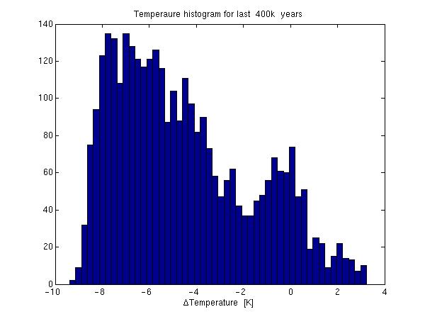 The figure does not reveal much more than what we knew from the figure above.
Frequency plots may be more useful with this dataset: Temperatures for Værnes airport
The columns represent
day--month--year--MeanTemp--MinTemp--MaxTemp
load vernestemp.dat
hist(vernestemp(:,4),100)
The figure does not reveal much more than what we knew from the figure above.
Frequency plots may be more useful with this dataset: Temperatures for Værnes airport
The columns represent
day--month--year--MeanTemp--MinTemp--MaxTemp
load vernestemp.dat
hist(vernestemp(:,4),100)
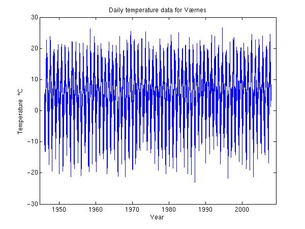
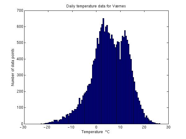 The temperature distribution is not as centered and symmetrical as one
would assume. This unexpected behaviour can not be seen from the temperature versus
date plot:
The temperature distribution is not as centered and symmetrical as one
would assume. This unexpected behaviour can not be seen from the temperature versus
date plot:
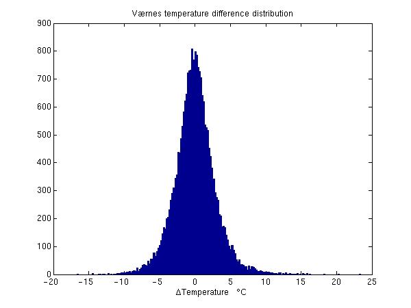
 The difference in temperature from day to day shows a more conventional distribution
hist(vernestemp(2:end,4)-vernestemp(1:(end-1),4),200)
title('Værnes temperature difference distribution')
xlabel('\DeltaTemperature \circC')
The difference in temperature from day to day shows a more conventional distribution
hist(vernestemp(2:end,4)-vernestemp(1:(end-1),4),200)
title('Værnes temperature difference distribution')
xlabel('\DeltaTemperature \circC')
Matlab uses for-end in loop constructs. One can use loops for smoothing of temperature data. for i=1:500;sm(i)=mean(vostemp(i:(i+10),2));end plot(vostemp(1:500,1),sm(1:500))
 Compare this to
plot(vostemp(1:500,1),vostemp(1:500,2))
Compare this to
plot(vostemp(1:500,1),vostemp(1:500,2))